ggplot練習
Don
/ 2020-05-07
/

最近由於需要把資料視覺化,因此就想說來順便練習使用R跟ggplot。
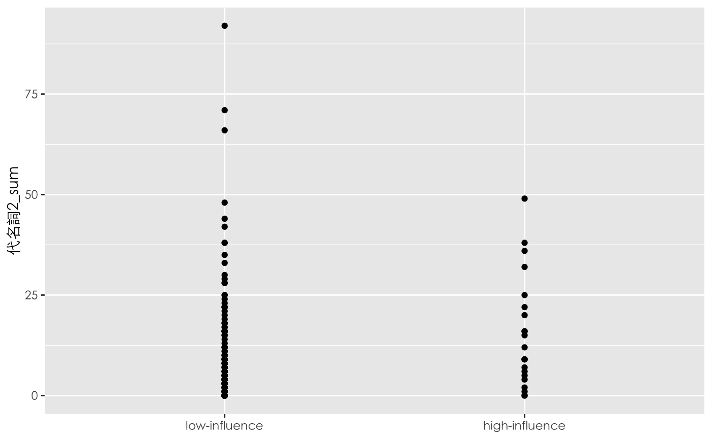
我的資料是PTT婚姻版上,分類出高影響力和低影響力的作者後,想看這兩類群體的代名詞數量是否有差異。
先用點圖來呈現,可以看到在低影響力的群體中比較離散。但是兩邊的資料幾乎都擠在一起,根本看不出實際的分布狀況。
ggplot(df, aes(高影響力, 代名詞2_sum)) +
    geom_point() +
    theme(text = element_text(family = "Heiti TC Light")) +
    scale_x_discrete(labels=c("FALSE" = "low-influence", "TRUE" = "high-influence")) +
    xlab(NULL)
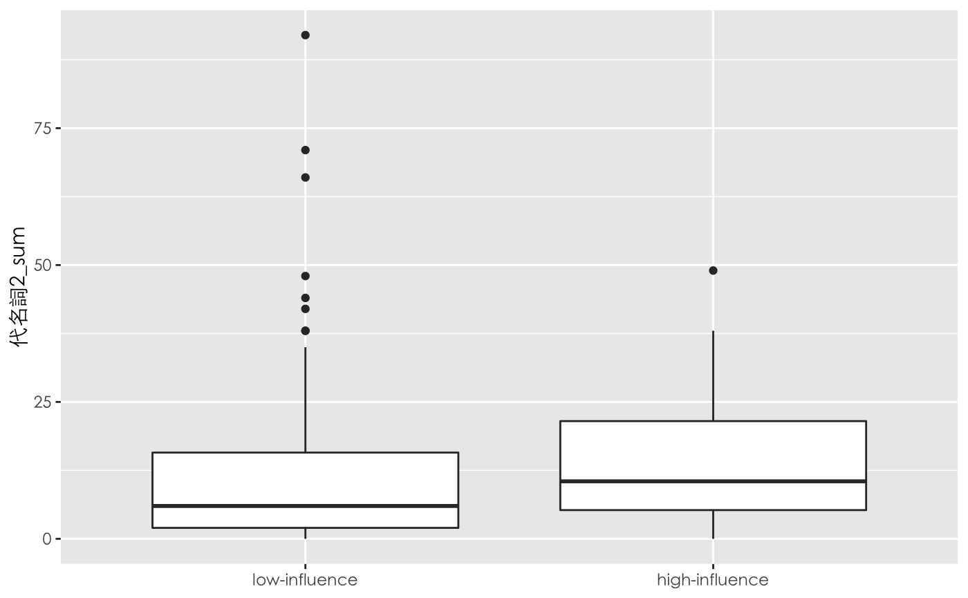
所以再用box plot來看一下,可以看到高影響力的群體中,使用第二人稱的數量的確平均來說比較高。
ggplot(df, aes(高影響力, 代名詞2_sum)) +
    geom_boxplot() +
    theme(text = element_text(family = "Heiti TC Light")) +
    scale_x_discrete(labels=c("FALSE" = "low-influence", "TRUE" = "high-influence")) +
    xlab(NULL)
最後是有在別的地方看到,有些人會在點圖的基礎上,幫兩邊的平均值連線,畫出一條直線,能比較直觀的呈現相關走勢。這是我這次學到的地方,使用stat_summary()的組合。
要畫出兩群資料中的平均值(圖中的紅點),只要輸入+ stat_summary(fun=mean, color="red", geom="point")就可以。而我遇到的困難是要將兩個紅點連線,一開始我是用 + stat_summary(fun=mean, color="red", geom="line"),但完全沒有跑出直線,後來上網找到答案,要加一個constant group mapping,也就是下面程式碼中aes(group = 0)的部分,才會work。
ggplot(df, aes(高影響力, 代名詞2_sum)) +
    geom_point() +
    stat_summary(fun=mean, aes(group = 0), colour="red", geom="line") +
    stat_summary(fun=mean, colour="red", geom="point") + theme(text = element_text(family = "Heiti TC Light")) +
    scale_x_discrete(labels=c("FALSE" = "low-influence", "TRUE" = "high-influence")) +
    xlab(NULL)
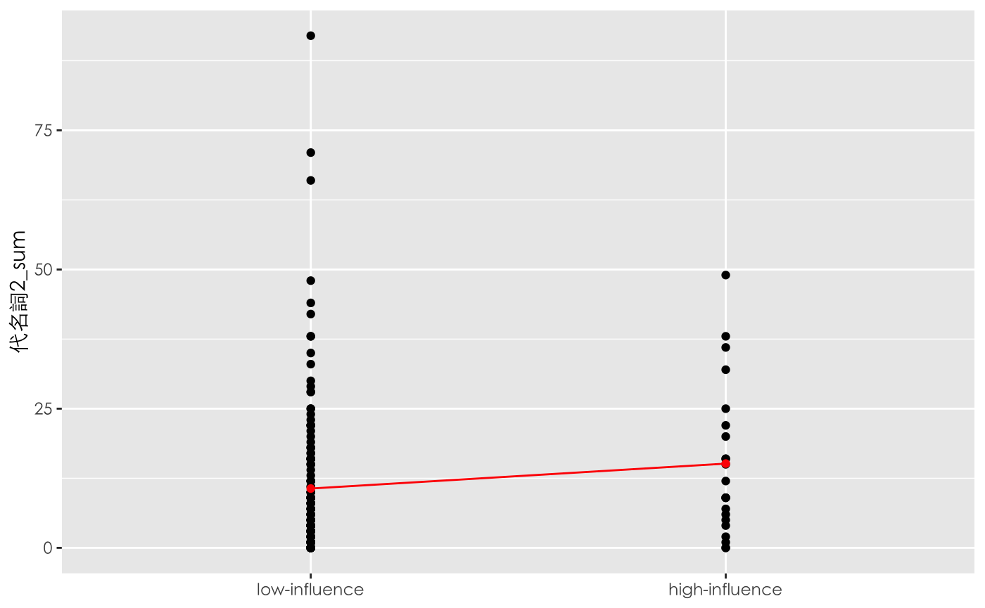
其實到底為什麼會這樣,我還沒理解,我先附上我找到的教學:ggplot2: aes(group = …) overrides default grouping